
Replacement Speedmaster Bezels
A short study of some replica, or replacement bezels
For the purposes of this article, I will define the following terms:
1. Original – Made by Omega, or its behalf by suppliers for fitment in factory by Omega
2. OEM Replacement – Original Equipment Made by Omega, or its suppliers, for fitment at a service approved by Omega. (Previously these bezels could be bought from parts dealers but Omega no longer allows this distribution). If you send an old Speedmaster that originally had a DO90 bezel, Omega will place a modern style bezel on it, and this has a different look.
3. Aftermarket Replacements– Made without permission and without Omega sanction, declared as such. and can be divided further:
A) Best Fit type – made to provide an inexpensive alternative to replace a bezel. These do not closely follow the design of the original and are without any connection to Omega, but also are not made with intention to replicate exactly the original. These are not a problem, and you can see many examples with a simple Ebay search, and the price is under $100.
B) Replica Type – made to imitate an original bezel, so as to be as hard to distinguish as possible.
The words counterfeit or fake are really only useful to describe the sellers intent, not the bezel itself.
It is the Replica DO90 bezel that we are most concerned with – one that imitates an original Omega bezel s closely as to cause it to be accidentally considered original, and valued as such.
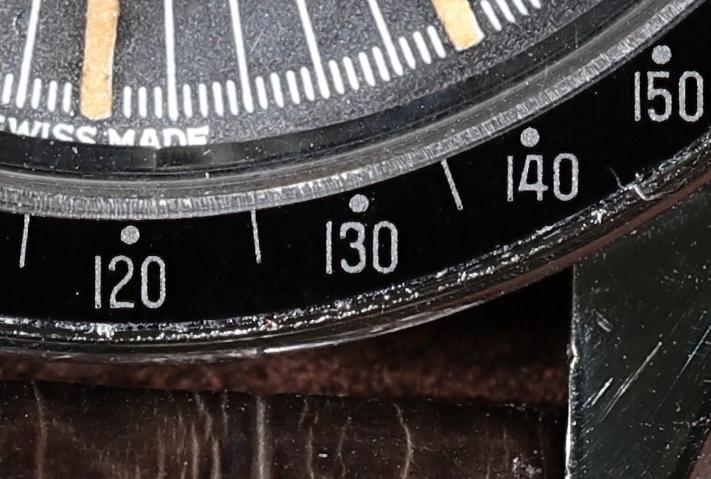
Genuine DO90 Bezel:
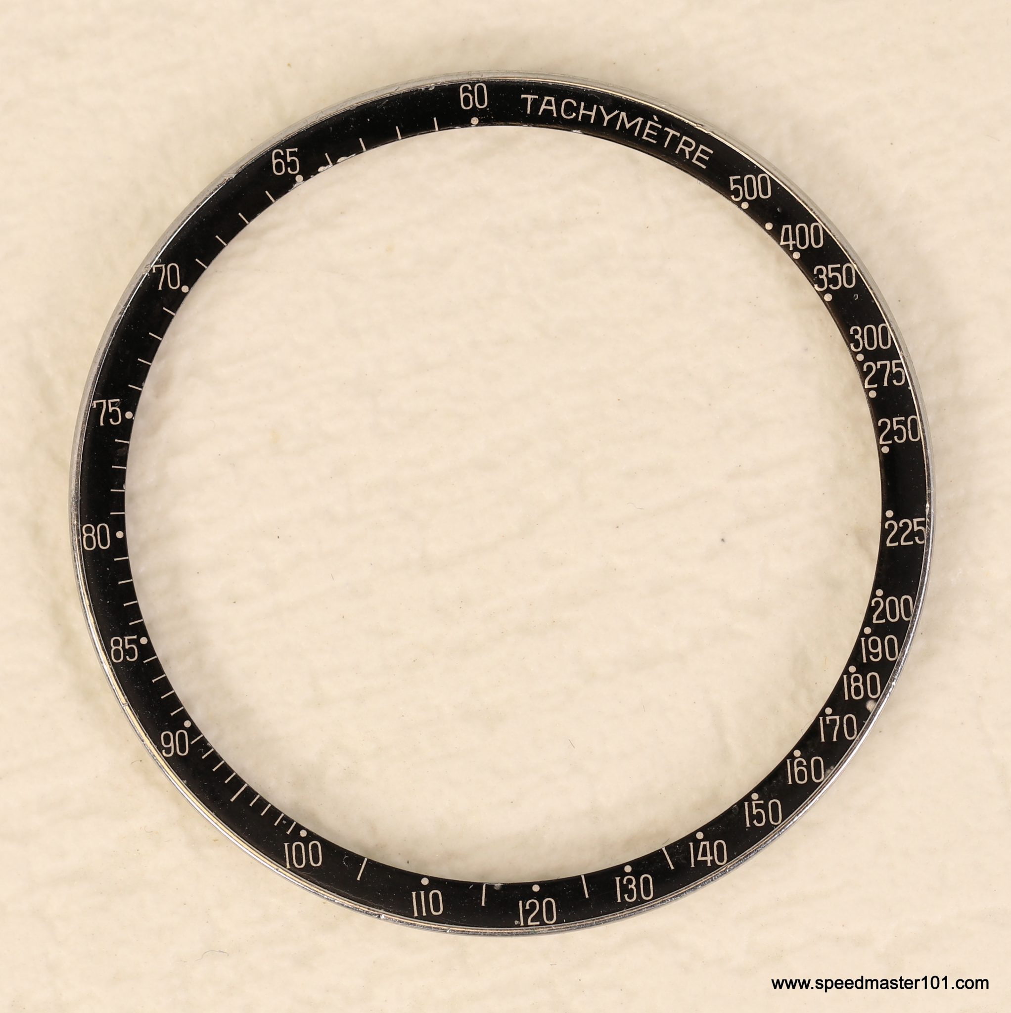
The bezel shown above is a genuine Omega DO90 bezel, as fitted to speedmasters circa 1962 to 1970. These bezels are valuable, and while the peak price of $5,000 (a few years ago) is probably not going to be achieved in the market today, there is certainly demand for bezels costing $2,000 to $3,000 for good examples. Having said that, I would not sell the example above for any money and there lies the problem, collectors who have good DO90’s do not need to sell them, and do not.
The replica manufacturers are always releasing updates and revisions, and so I will not give a detailed comparison of my entire library of replicas. Rather I would urge you to become familiar with the originals, and these are the important points. There are more, but start with these:
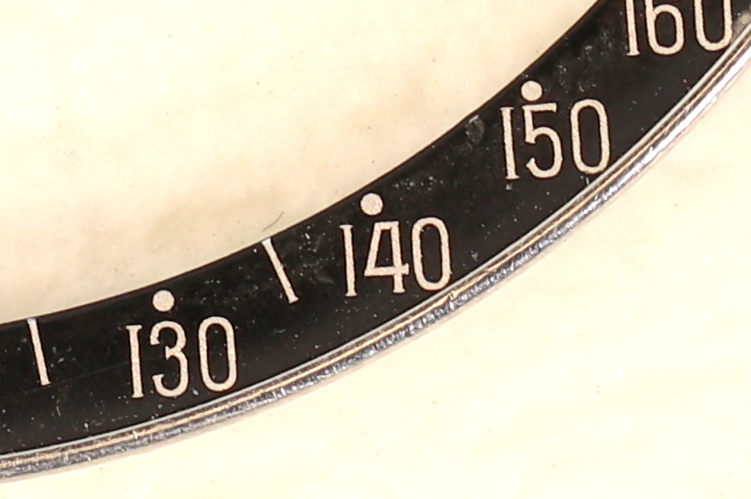
- First is the DO90 which is the first thing we look at. Note the thin stretched font,
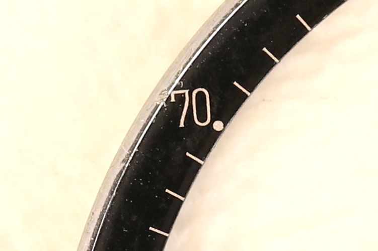
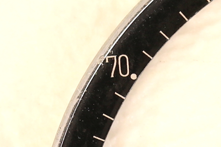
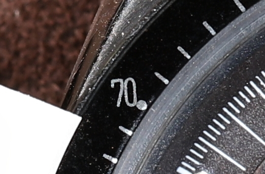
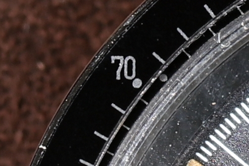
- Next we look at the 70, and note the font, including the serif on the 7.
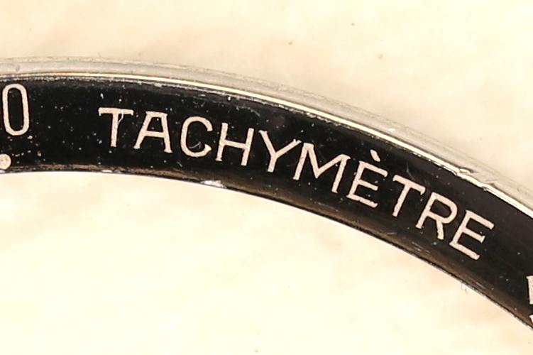
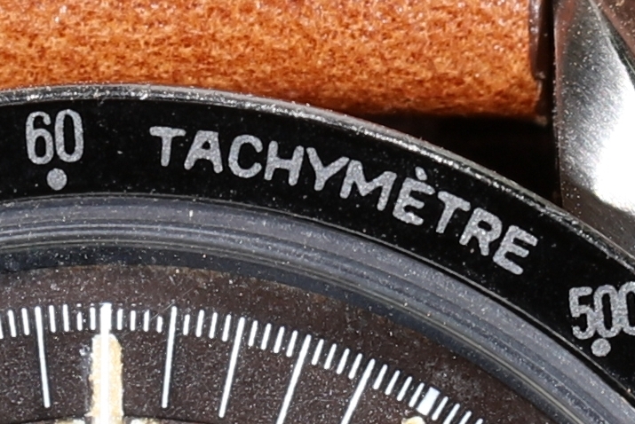
- The letters in TACHYMETRE are sharp and clear. Note the flat A.
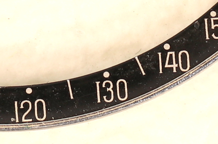
- On the 130, we see the serif on the 3.
- There is also the positioning for the dot placements in the replacements.
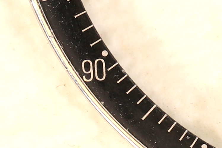
Close-Ups of Genuine Omega DO90 Bezel
Disclosure of “Tells”
I am not going to disclose all the tells, as I now agree with the concept that it is better to keep what we know to ourselves, rather than point the counterfeiters in the the right direction.
My own collection of replicas is now over a dozen different types. Each has its own set of tells, but each does have them and they are different from an original.
Things to bear in mind with originals is that they can have thicker print. (Perhaps the print die is worn out?). The colour can fade. The numbers can be cut off, to the left usually. That is the top of the 7’s are cut.
There can be quite a variation in appearance of genuine DO90 bezels, in terms of placement of the entire layout, and the print can vary in thickness. What does remain constant is the relationship between print items, and the shape of the fonts.
Comparisons.
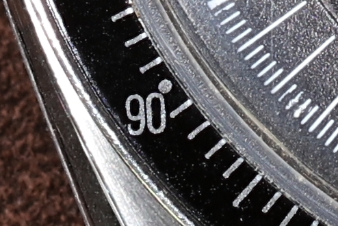
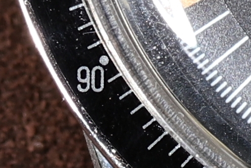
Here I will put side by side examples of two replicas and a genuine one. On the left is the genuine, the centre is what I call “Canada” bezel.The right is what I call “SanFrancisco” bezel. The nick names come from where I got them from, but I think a lot are made in the far east and sold through USA re sellers.
Here we look at the 90. Note the distances between the dot and the font difference.
Conclusion
When I look closely, under a loupe, it is easy to spot the differences as long as I know what to look for. Another thing to add is that as a result of me being a bit obsessive, the more I look the more familiar I become with the genuine, and therefore it is easier to spot a fake.
The “Canadian” bezel is not really a viable counterfeit. The font is too thick, and lacks serifs on 3 and elsewhere, and the dots are incorrectly placed. It would not confuse anyone but a naive buyer.
The SanFrancisco bezel is closer, but still collapses when I compare the fonts, the size of the dots, and the positioning. It will fool people without resources.
Note that this article presents only two replacement bezels – I have a stock of nearly a dozen replicas in a library of potential counterfeits, and I do not present them here as there is not much to be gained.
You must be logged in to post a comment.